The cover art for the 7 May 2010 issue of the Journal of Organic Chemistry accompanies the article by (2nd semester organic chemistry professor, co-author, and 2010 American Chemical Society James Flack Norris Award in Physical Organic Chemistry recipient) John E. Baldwin and Alexey P. Kostikov entitled "On the Stereochemical Characteristic of the Thermal Reactions of Vinylcyclobutane."
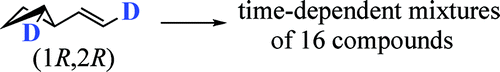
This Perspective outlines the stereochemical and mechanistic complexities inherent in the thermal reactions converting vinylcyclobutane to cyclohexene, butadiene, and ethylene. The structural isomerization and the fragmentation processes seem, at first sight, to be obvious and simple. When considered more carefully and investigated with the aid of deuterium-labeled stereochemically well-defined vinylcyclobutane derivatives there emerges a complex kinetic situation traced by 56 structure-to-structure transformations and 12 independent kinetic parameters. Experimental determinations of stereochemical details of stereomutations and [1,3] carbon sigmatropic shifts are now being pursued and will in time contribute to gaining relevant evidence casting light on the reaction dynamics involved as flexible short-lived diradical intermediates trace the paths leading from one d2-labeled vinylcyclobutane starting material to a mixture of 16 structures.
The cover image is meant to convey as much useful information as possible without any verbiage, although this is clearly not a concept meant to be crystal clear to a non-chemist (but kudos if you got the idea without my having to address it).
 |
Included below are the four iterations involved in the cover draft, between which a considerable amount of verbal back-and-forth occurred (that is discussed briefly) to get what was intended to be presented. The iterations are provided both to show how different visions of what might be seen as the most-key of the key points change as content is presented to the client/researcher and, frankly, these all involved quite a bit of busy work and it seems a shame to not have them floating around somewhere accessible.
 |
The original cover idea (above) was quite mundane but provided a bit more information (cryptic as it may appear to the non-mechanistic organic chemist) about what might be occurring in the absence of a brief read of the introduction of the article. This image emphasizes that a constant rearrangement occurs of the vinylcyclobutane (by the many, many arrows and the four different arrangements of deuteriums in the rearrangement) but does not address that the other 12 structures are products of reactions that are generated as the vinylcyclobutane rearranges and undergoes other but simultaneous intramolecular reactions. The absence of the connection between the rearrangement and the formation of products (which include the vinylcyclobutanes) removed this first iteration from the final running.
 |
The second iteration (above) is a significant (well, I think so) improvement in the getting-across of the business end of the research. The vinylcyclobutane rearrangement is still central to the preferred emphasis of the cover (soon to go away) and the connection between the rearrangement and the formation of products is now hinted at directly by the use of the faded arrows. The second-tier information passed along in this image is that the vinylcyclobutane is one of the products, which is not stressed in the image (by the inclusion of four additional arrows from the central graphic (and, with that addition, the inclusion of arrows feeding the vinylcyclobutanes back into the center). If this had been an Angew. Chemie article, the circular design would have been a perfect fit.
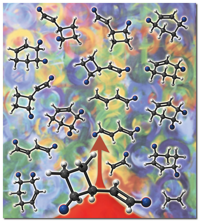 |
It was at this point that a new piece of content was provided in the form of a medium-resolution digital photo of a piece of artwork by Anne Baldwin. The artwork was chosen as much for the colors as for the chaotic quality of the swirls, which was the one aspect of the entire process that the previous two images did not address and which Dr. Baldwin saw as the more significant point to convey. Some Gaussian blurring and a Gaussian basis set later, the new reactant/product combination as scrambled to complement the background and to make clear that one molecule (that at the arrow) lead to everything else in the image, including itself. The slight red halo around the deuterium (dark blue) is a result of an overlay of the blue spheres and red spheres rendered with slightly larger radii.
The arrow color and shading was stolen from Jean-Michel Folon. Example (The Cry) below. If you've one of the copies of La morte di un albero (mine is #630), see Comme un aimant (1971).
 |
I admittedly prefer this (that is, the above cover idea) to the final version as the arrow indicates the forward direction of reactions and adds a hint of symmetry to an otherwise jumbled image.
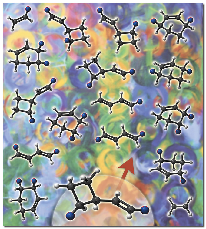 |
As for the selected cover image (and final iteration, above), the considerable real estate taken up by the vinylcyclobutane in the previous image is recovered, which highlights the starting molecule differently and has the arrow simply angled into a less-busy space.
The final selection may make more sense in light of the image Baldwin chose to use for the graphical abstract.
 |
A word to the perspective cover artist – This is a point that should be obvious but is often not until it is made obvious by an editor when it is much too late. Your images should be as LARGE as possible. Each of the images above is a 200 MB Photoshop file that would print without pixilation or granularity at 600 dpi on a 24" x 36" poster.